The Alcove Restaurant - Full Branding
Industry
Restaurant
Client
sumeen
Service
Date
June 2025
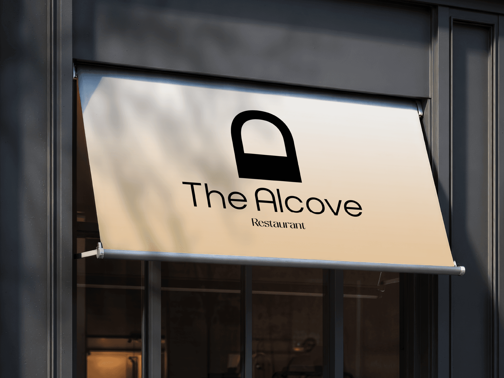
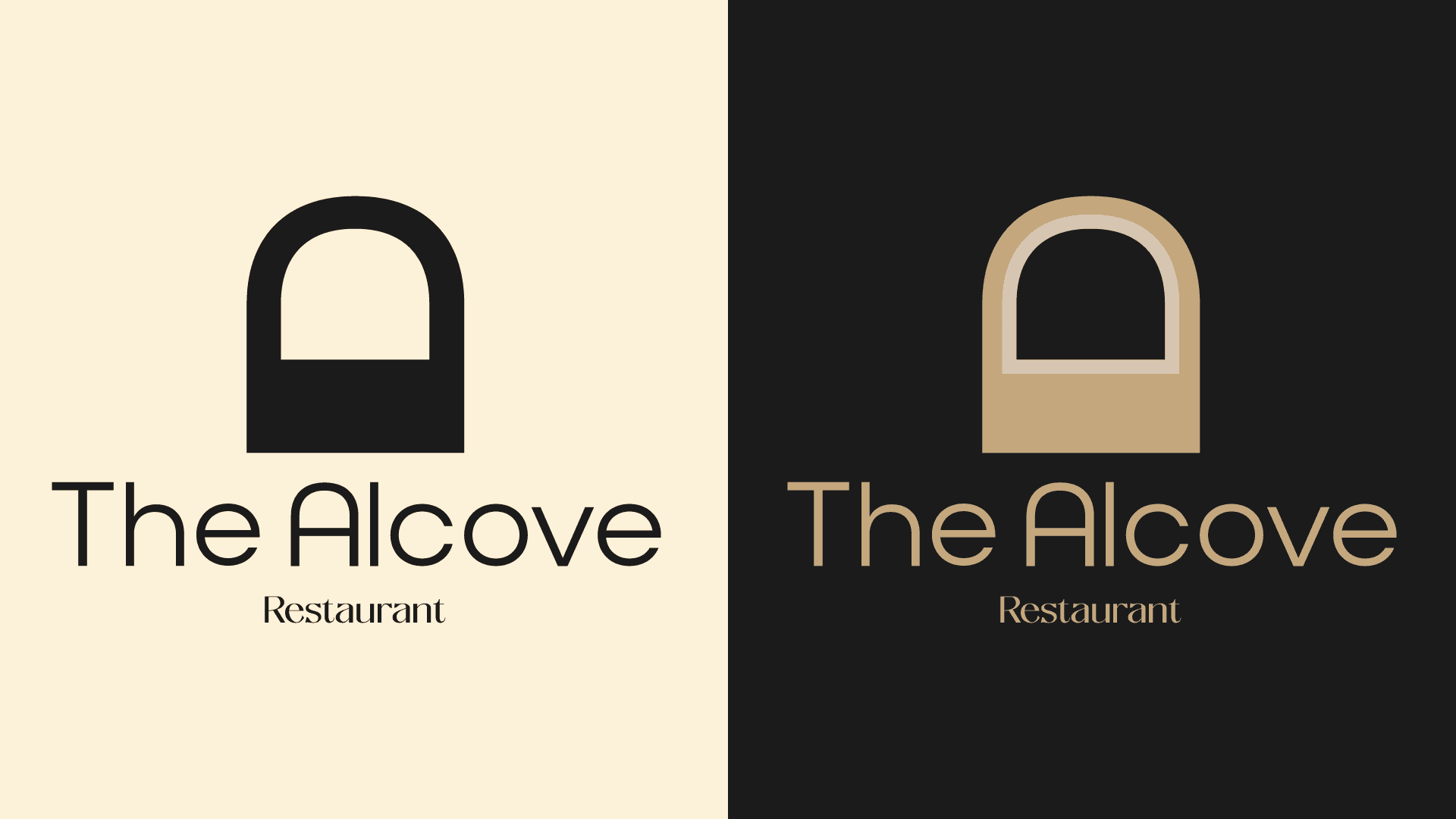
A minimalist and elegant identity designed for The Alcove—a restaurant that values intimacy, detail, and atmosphere. The logo features a stylized archway symbol, hinting at the architectural meaning of an alcove: a quiet, recessed space. It captures the essence of a refined dining experience—inviting, warm, and a bit hidden away.
The typography is clean and modern, with a subtle contrast between the brand name and the word “Restaurant” to add visual hierarchy. The soft beige backdrop and black logo combination keep the presentation understated yet sophisticated—perfectly suited for signage, menus, and interiors.
This brand is all about subtle charm and timeless simplicity.